This personal project is for Spirit Airlines, a redesign that targets the "flyer on a budget". As the design features "you see what you get experience" while providing a "tell it like it is", yet trustworthy, professional experience.
Landing Page
I wanted the landing page to depict the "spirit" of the Airlines choose to use color blocking mixed with hand drawn designs to incapsulate trustworthiness and safety, all while adhering the Spirit brand.
I updated the typeface to 'Comic Sans Neus' to give that professional and lighthearted feel. We know tat Spirit has a reputation, so Spirit "owns it" by using a slight humorous and straight forward approach to the brand tone.
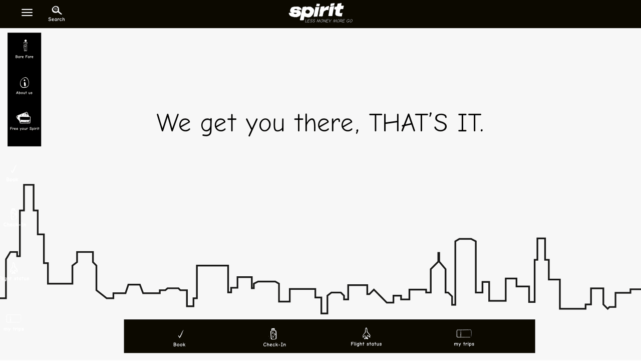
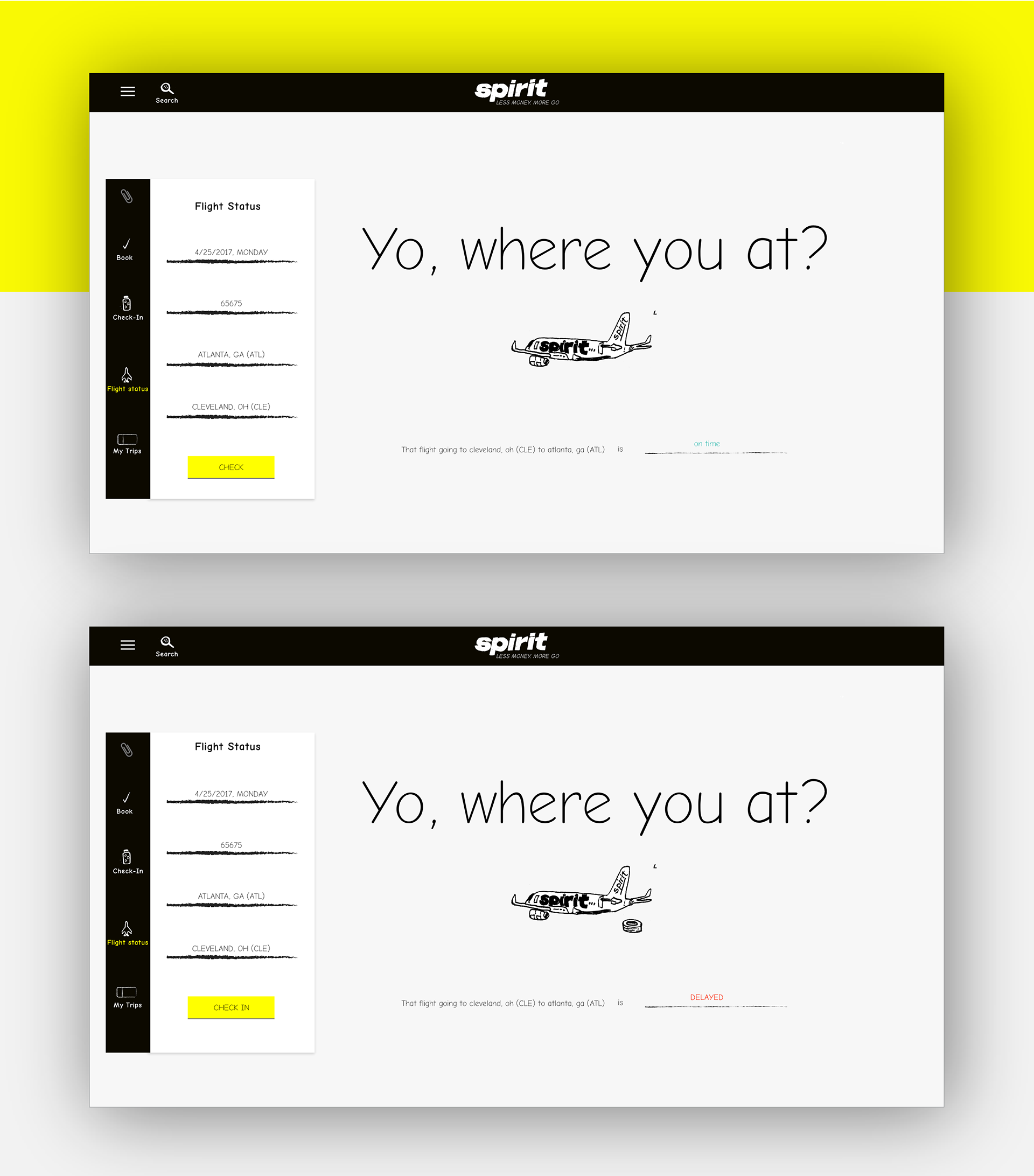
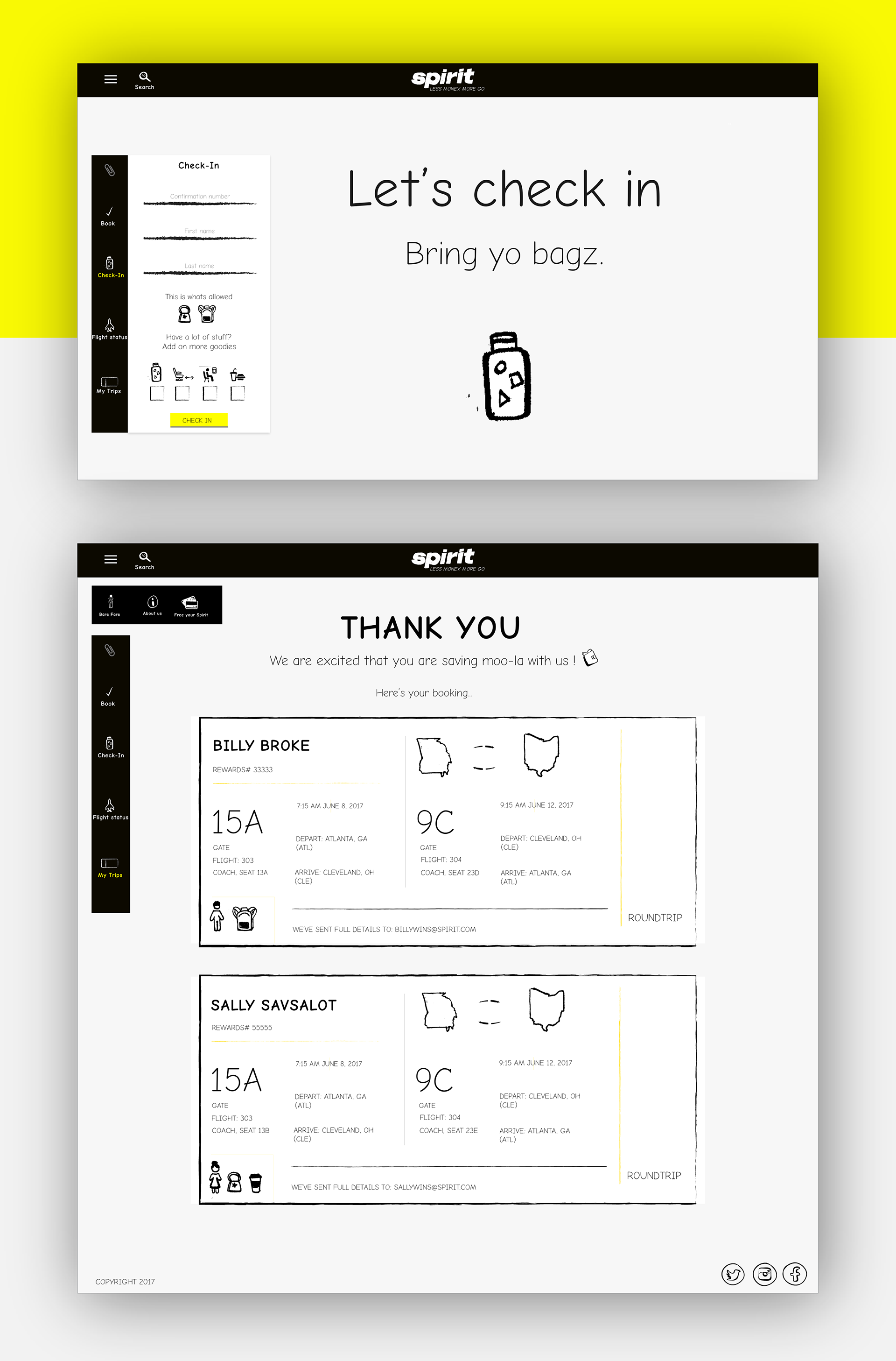
Floating navigation on left and bottom of page makes sure you can check important flight details anytime-on any page.
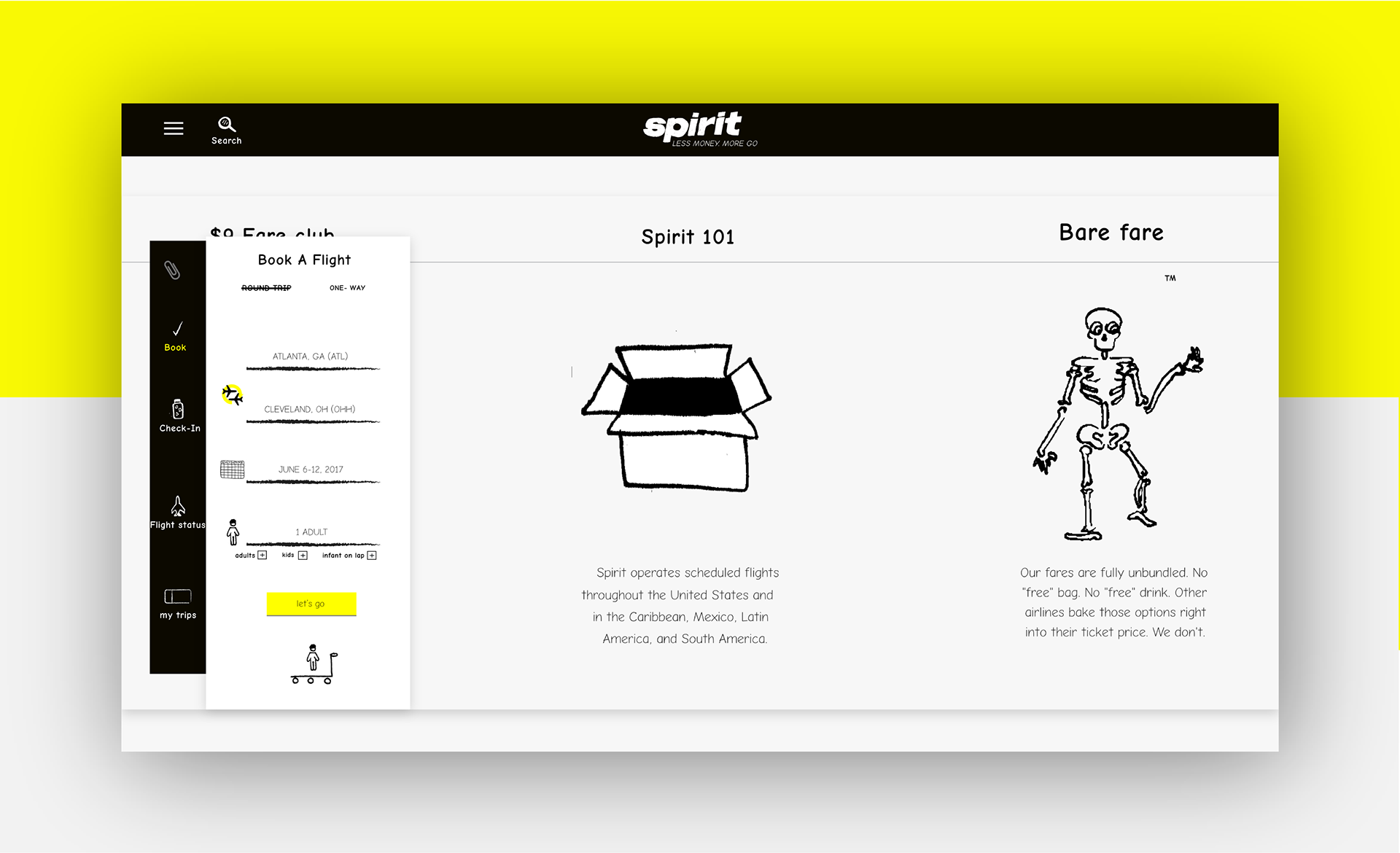
Vertical Navigation Site Prototype
The sticky menu of the left, uses icons and a mix or hard lines and color blocks to push the professionalism of the user's travel experience.
Horizontal Navigation Site Prototype
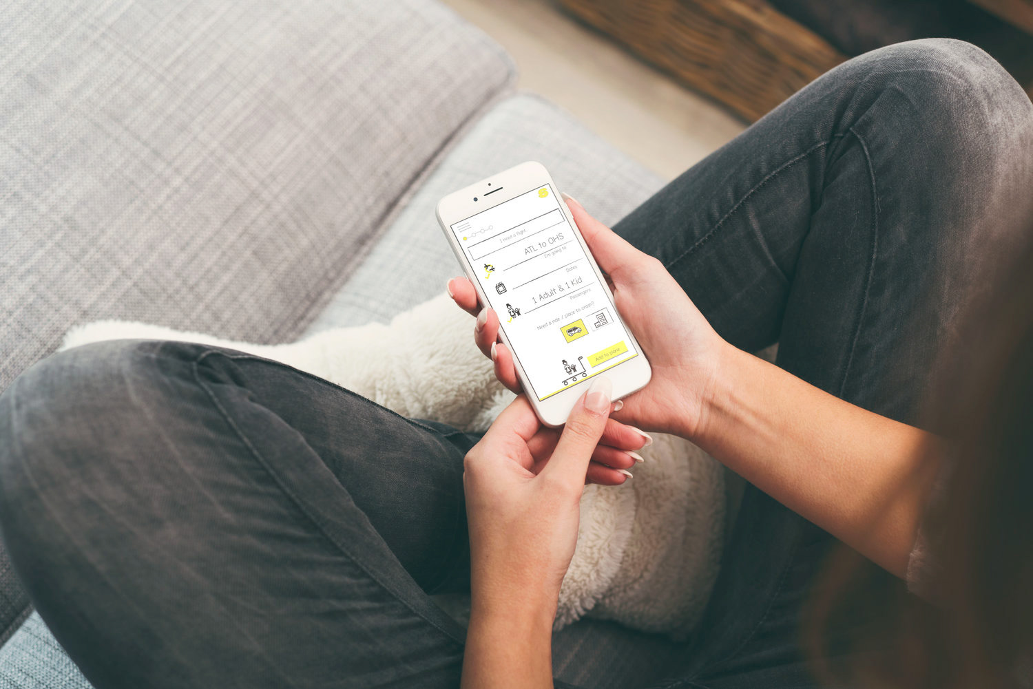
Mobile Site Prototype
Hand-drawn Icons

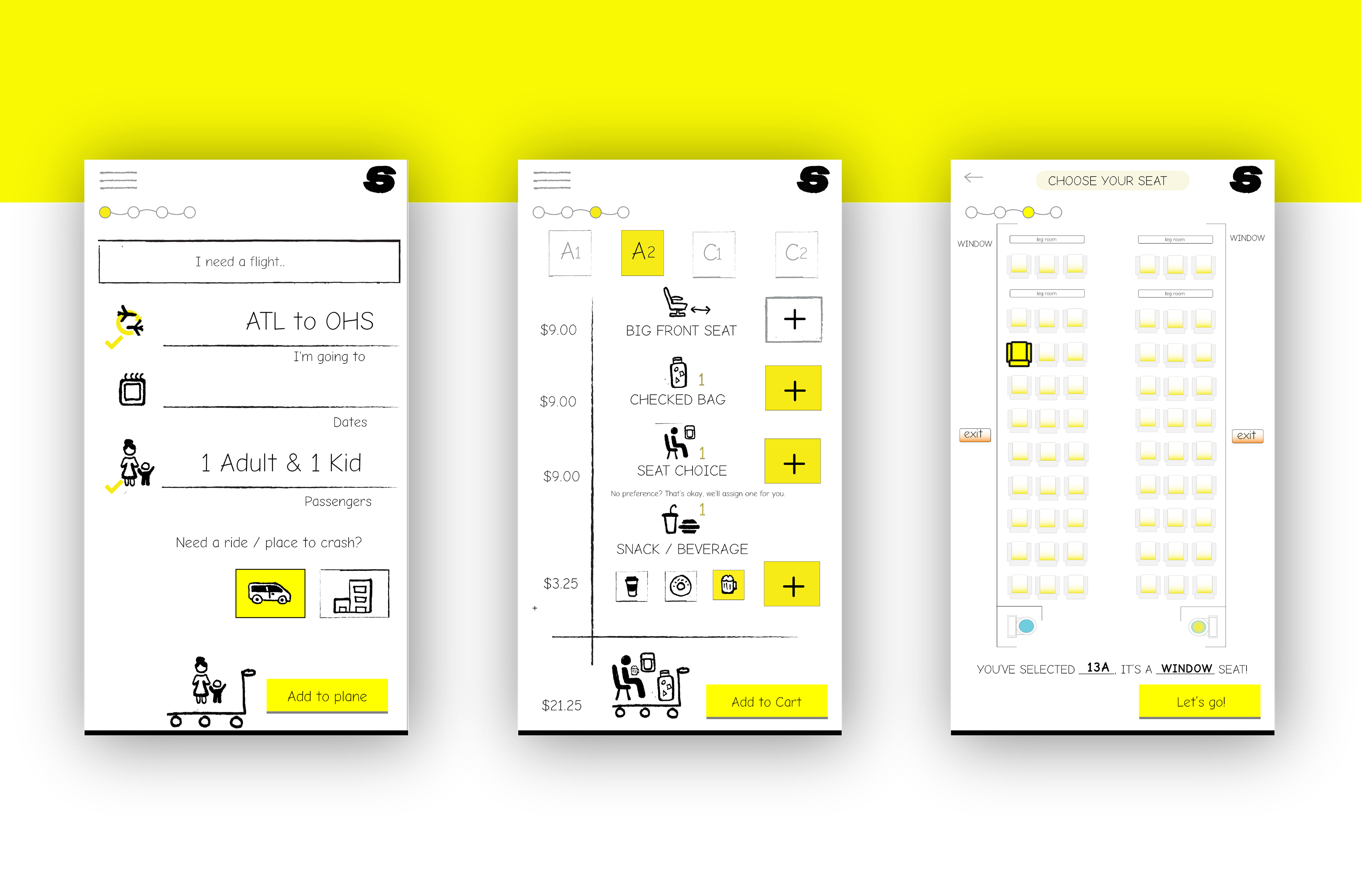
Mobile Views
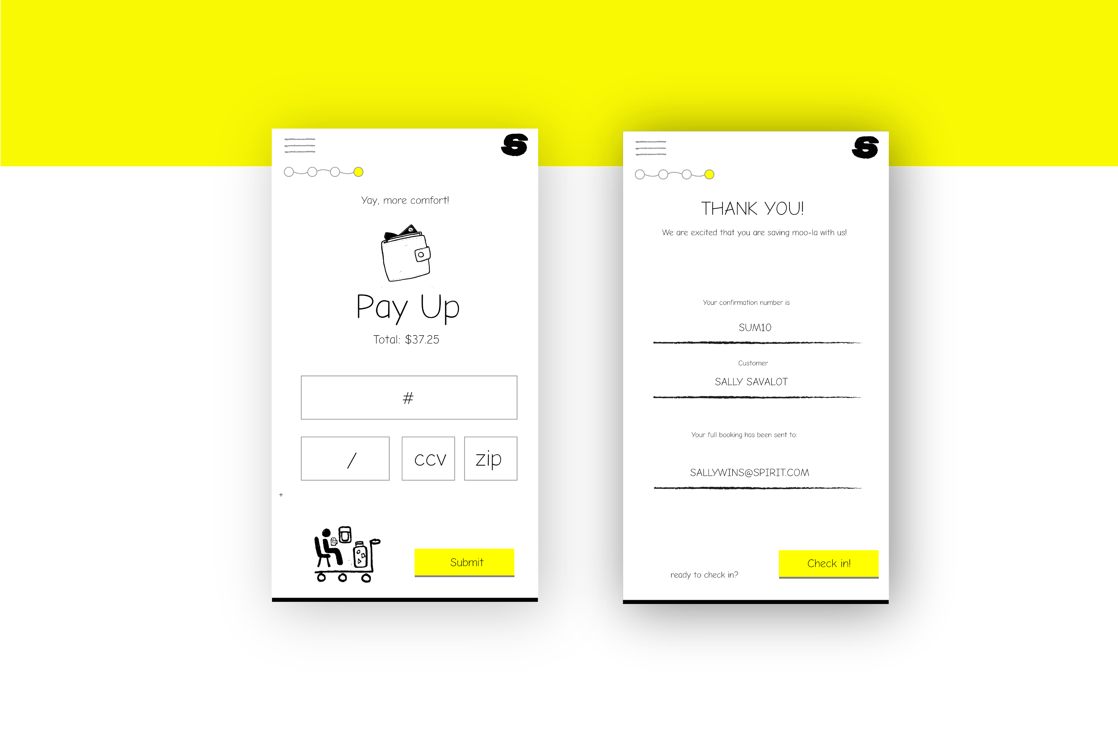
Mobile app turns the booking experience on its head, by adding an enjoyable "add to trolley" experience so passengers can book with confidence and budget accordingly with satisfaction.
Mobile Experience feature an Add to Cart experience where visuals show exactly what you will have during your flight.
Checkout and Confirmation