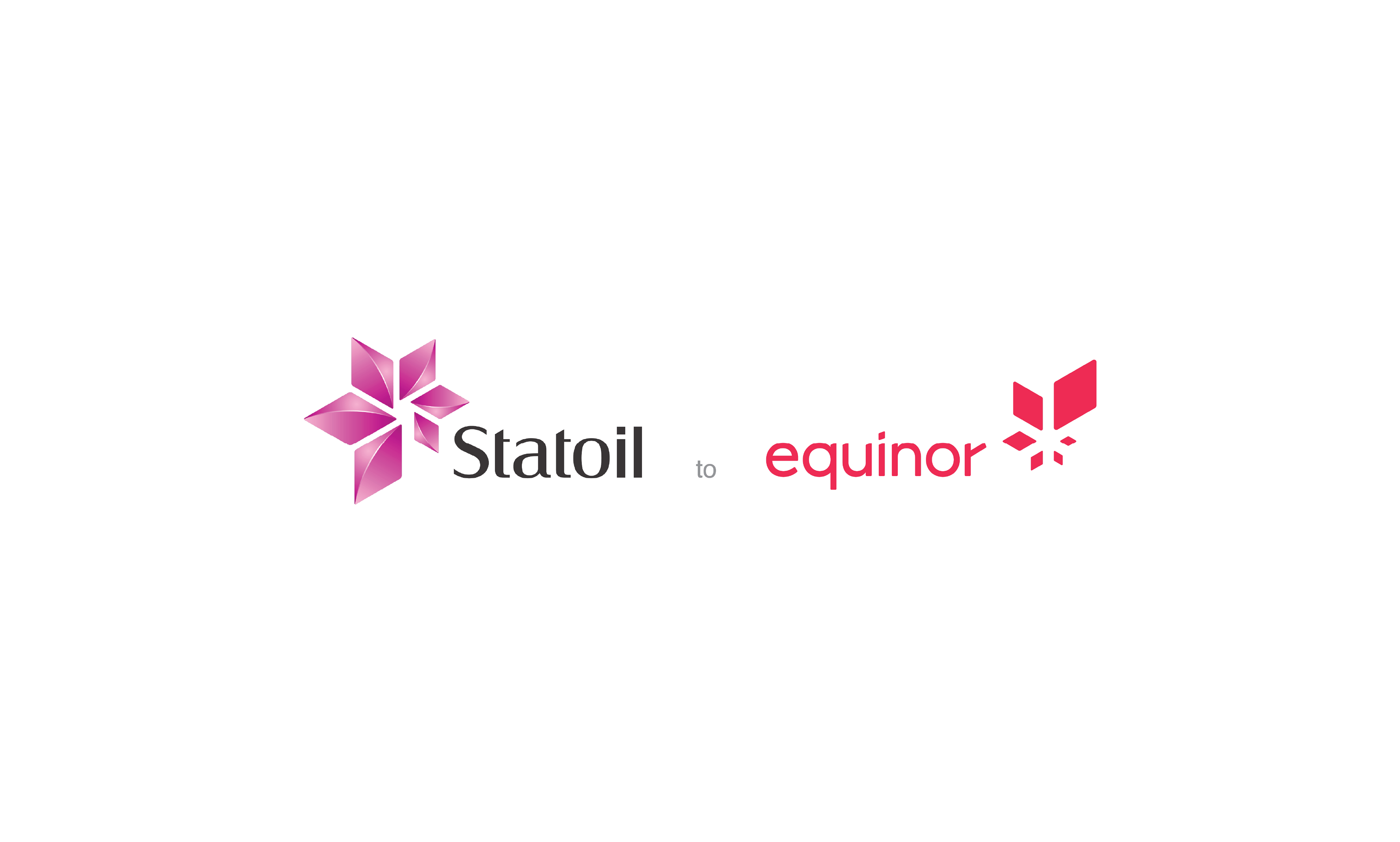
This is rebranding product for energy company, Statoil. The board of directors of Statoil proposed a change to the name of the company to Equinor. Where a small team of 2 designers designed new assets, custom icons, web ads, and print leave-behinds to support the name change and enhance to the company’s new strategy and development.
Find below my contribution to this project!
Logo designed by Superunion
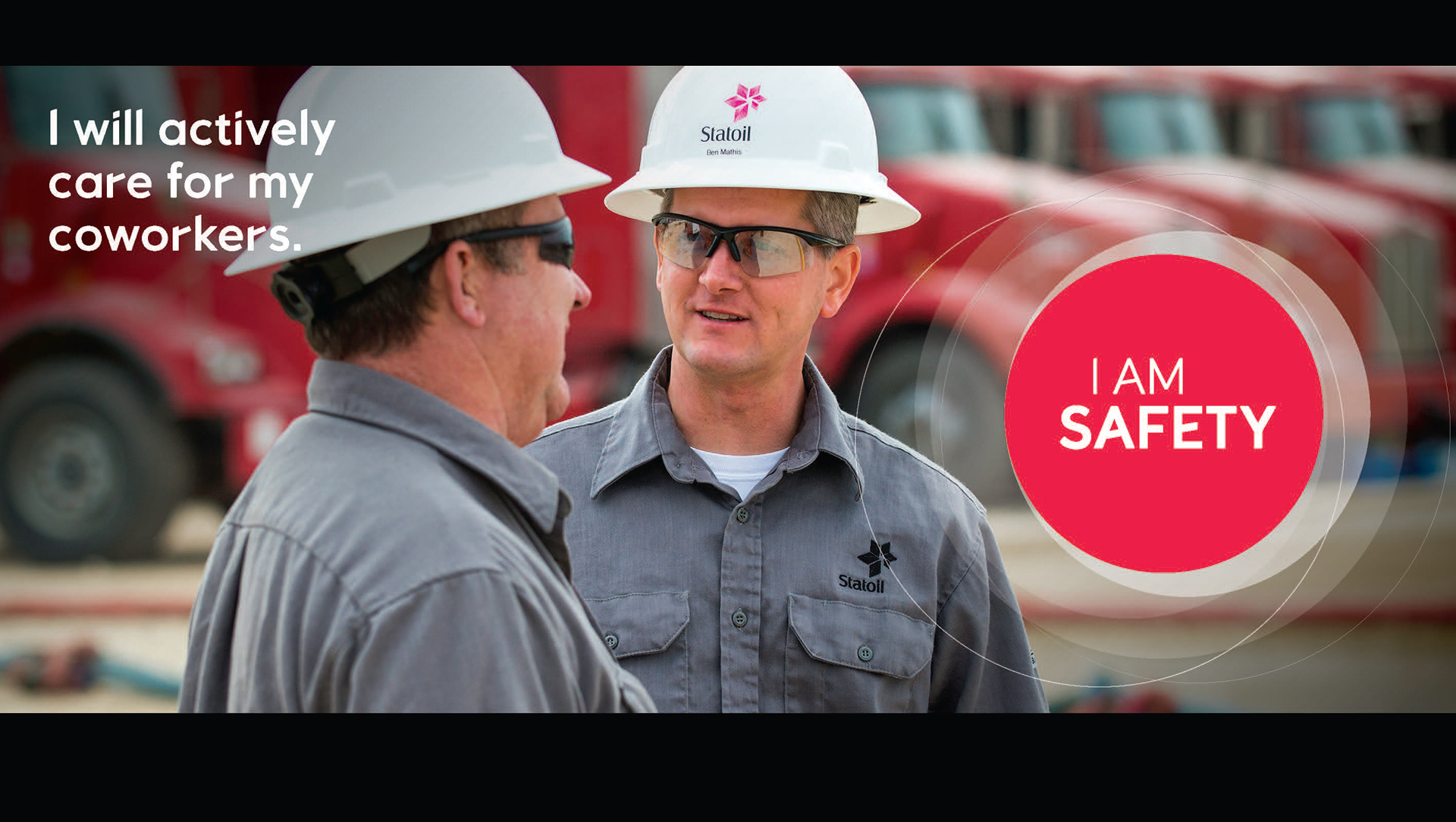
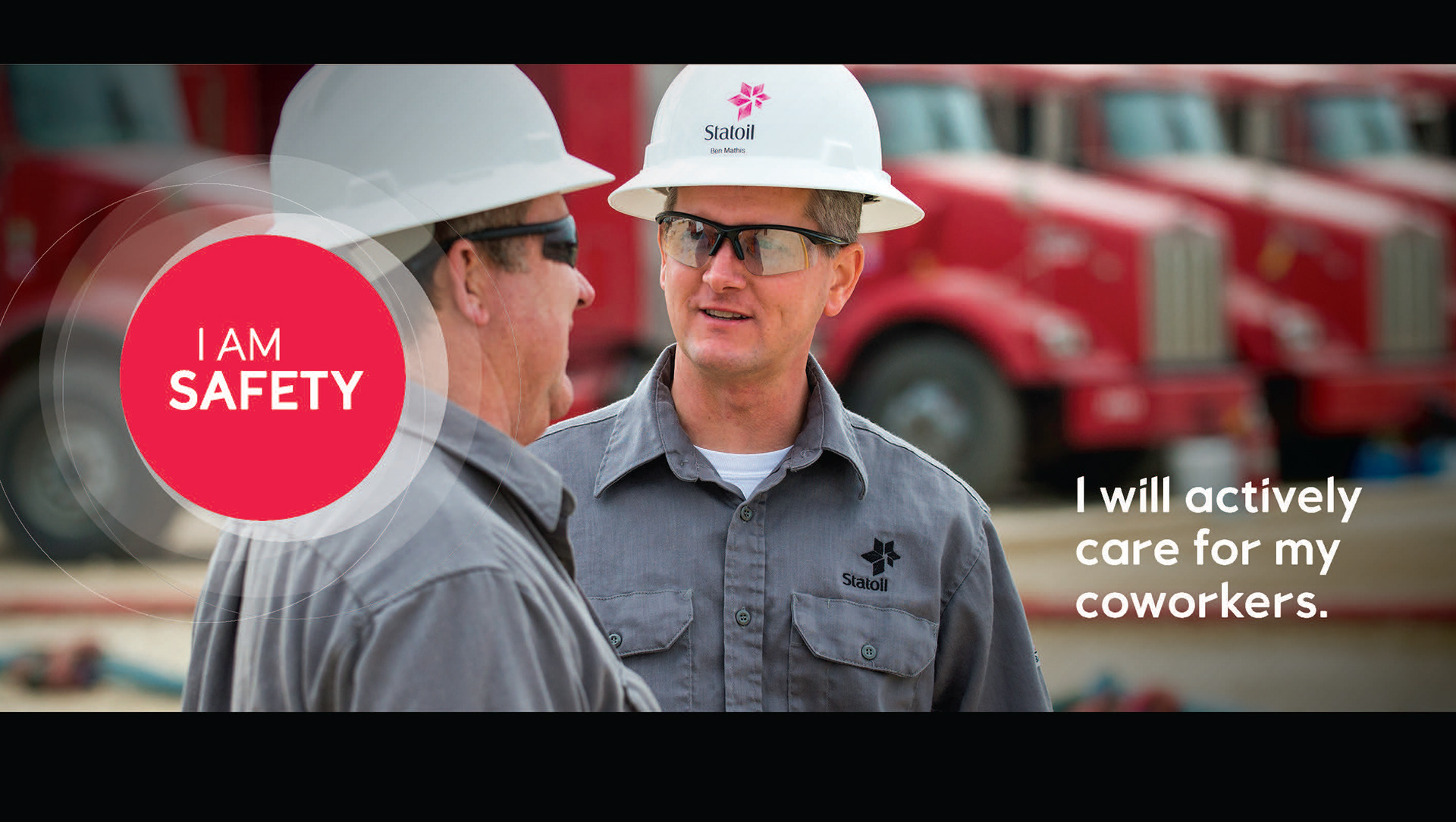
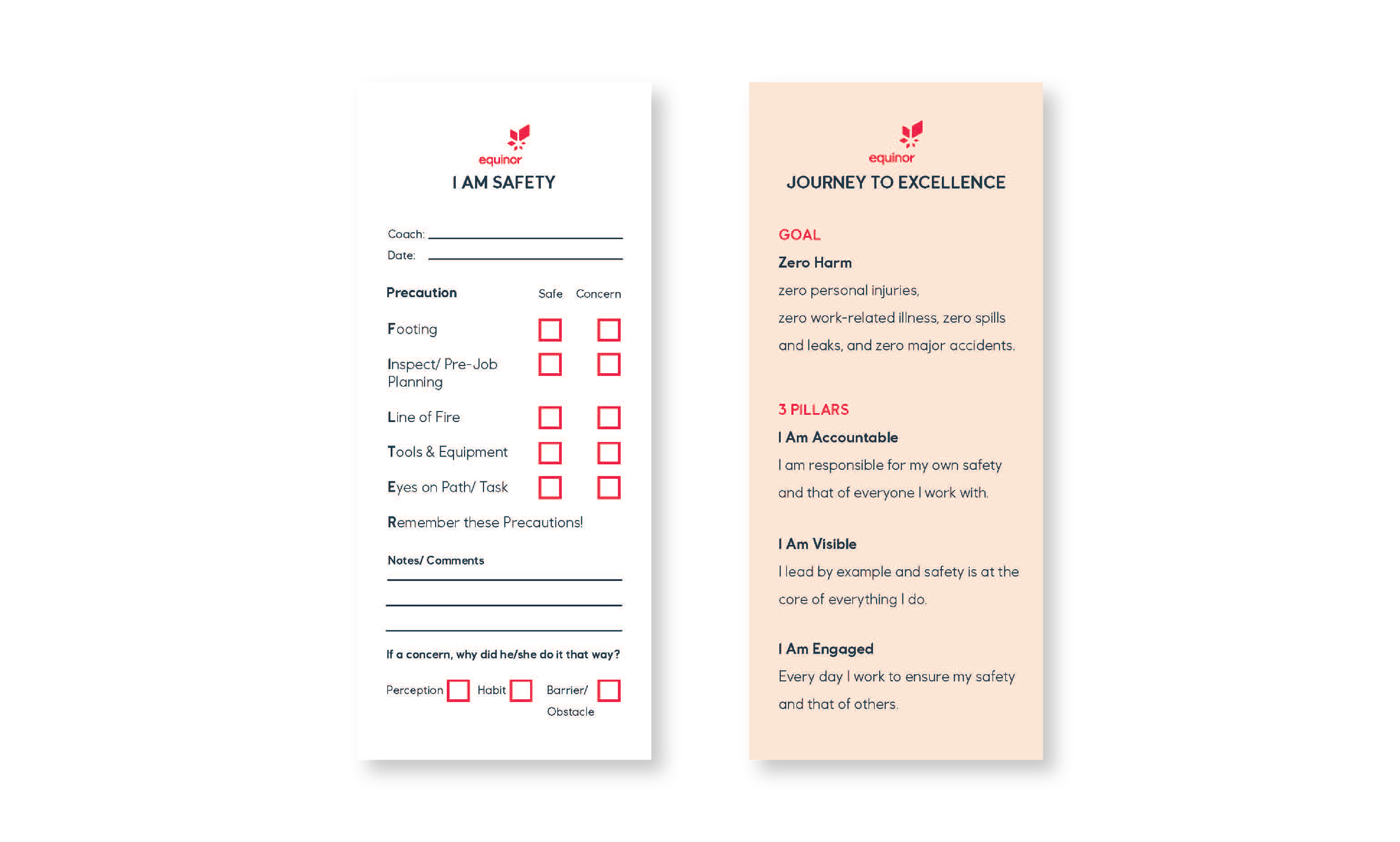
"I AM SAFETY" Information Banners
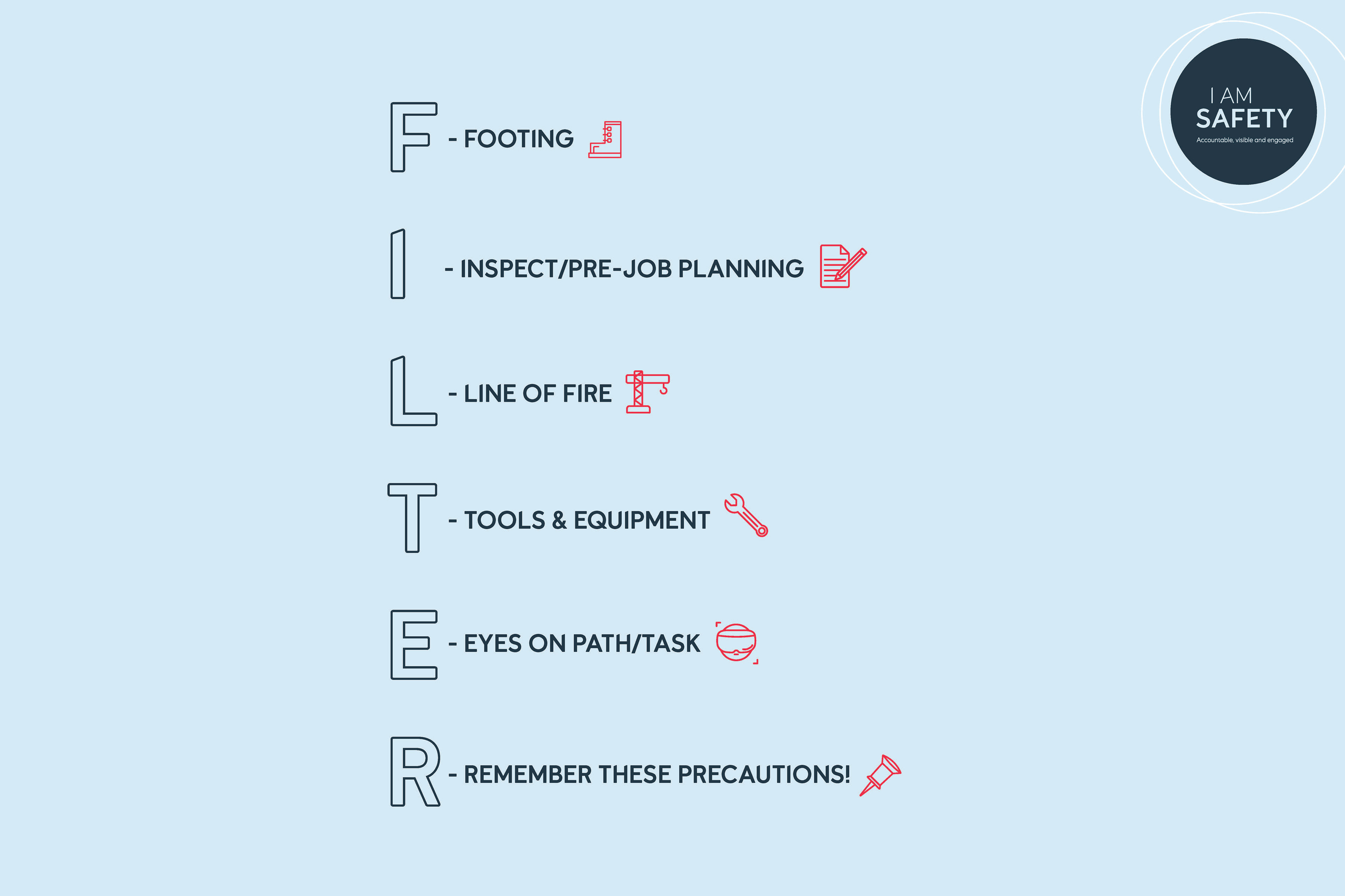
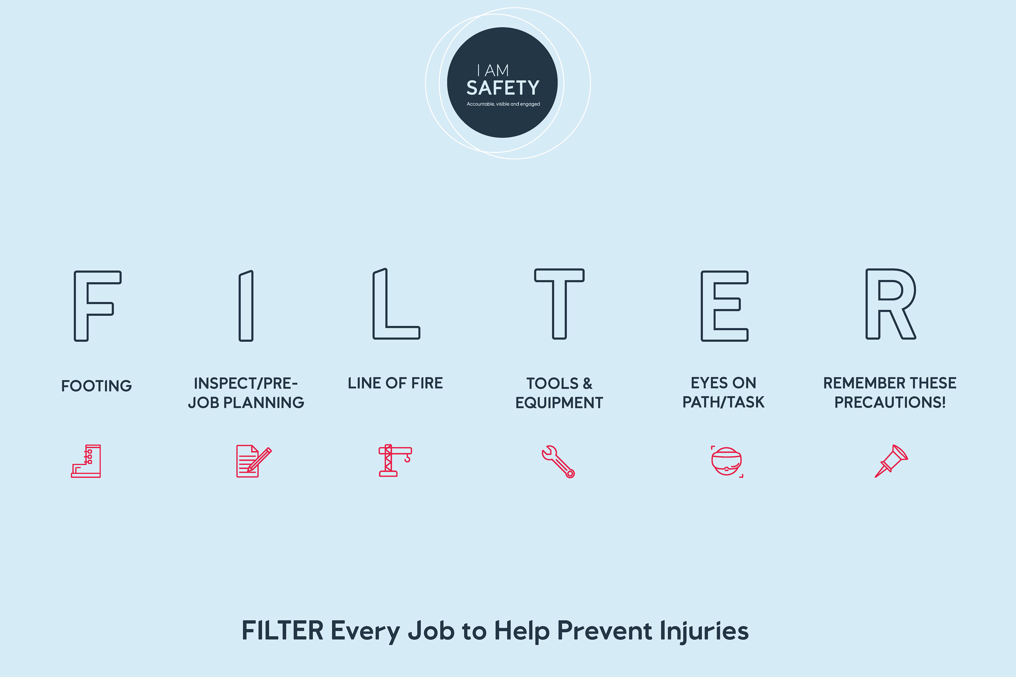
F I L T E R Posters
Displayed on rig and in-office for employees to affirm safety guidelines.
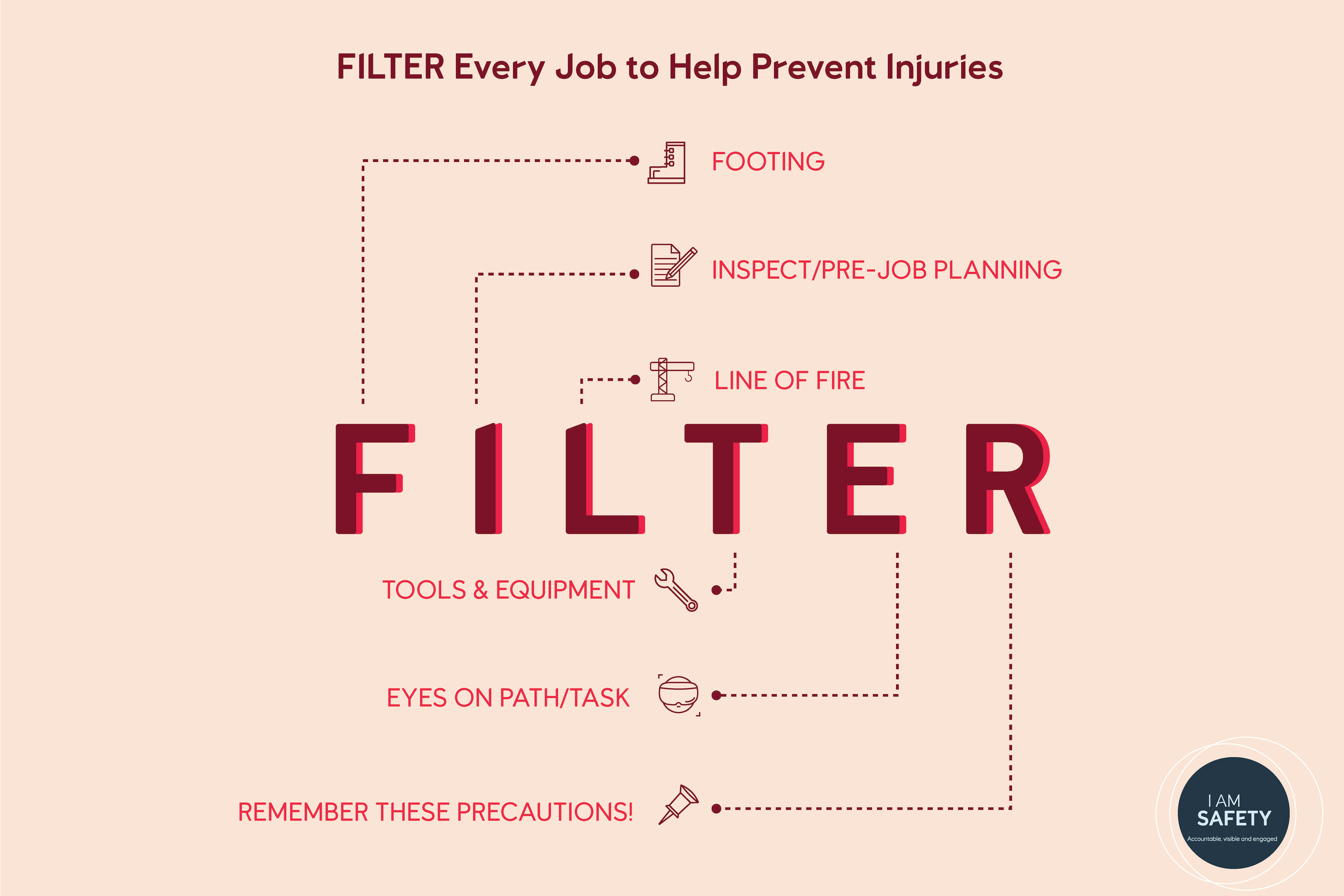
F I L T E R Cards
Card was redesigned for boarding visitors and contractual workers.
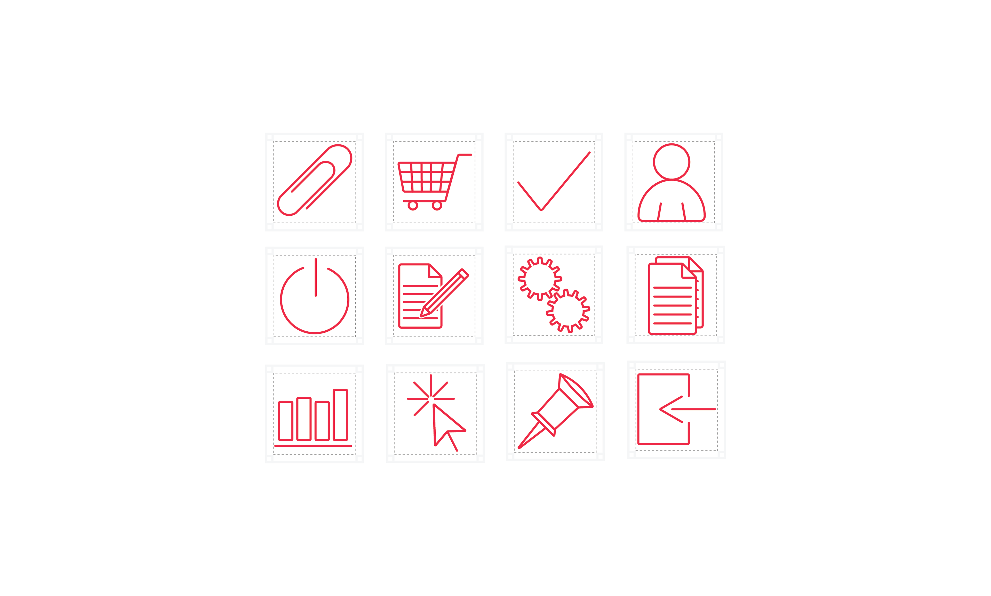
New Equinor Icons
I designed new icons, that were used in graphics, the website, and other applications!